22 AAG Members in Belton Juried Show
- Oct 5, 2021
- 3 min read
Twenty-two Anderson Artists Guild had 31 pieces in the 2021 juried art show at the Belton Center for the Arts, which opened on September 25 and will run through November 5. The juror was Jessica Burke.
Seven members won awards. Evelyn Beck won second place for Miami Beach (fiber). Kate Krause won a purchase award for Earth, Wind and Fire (clay). Merit awards were given to Matthew Brophy for Black Tie Optional (raku-fired ceramics), Hamed Mahmoodi for Veil in Glass (acrylic), Brenda McLean for Hallelujah Sunrise (pastel), Yvonne Park for Pink Regalia (oil), and Lori Solymosi for Stepping into the Light (acrylic).
Other members in the show are JoAnne Anderson, Marion Harvey Carroll, Melody Davis, Jane Friedman, Myrl Garment, Carolyn Gibson, Diana Gilham, Laurie King, Terri McCord, Stan O’Bannon, Donna O’Hara, Gloria Root, Diann Simms, Diana M. Walter, and Sue West.
A virtual exhibit of the show can be seen at https://www.beltoncenterforthearts.org/jas2021.
Here are reflections by some of the award winners on their pieces:
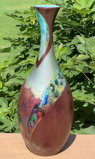
Black Tie Optional (raku-fired ceramics) by Matthew Brophy
“This piece was an experiment for me. I crushed up broken pieces of colored glass and added them to a particular glaze that held the glass on the vessel. The result was very unique, as raku pieces always are. The only problem I encountered making it was the day of the firing it was 95 degrees out and humid. I think I lost ten pounds firing it!”

Hallelujah Sunrise (pastel) by Brenda McLean
“I recently became interested in portraying the unbelievable brilliance of the sky at sunrise and sunset, especially the light reflecting in the lakes all around us and bouncing off of the cloud formations. I was never successful representing those colors in oil or acrylic, but the freshness, purity and brilliance of soft pastel sticks really puts me right there in intimate contact with my substrate, no brushes or mixing to slow me down. I never tire of capturing the transitory nature and the variations of form, value, and hue of the rising or setting sun. I have taught several pastel classes on painting the sunset sky in an effort to share my enthusiasm for the subject.”

Pink Regalia (oil) by Yvonne Park
“This was inspired from a photo I took while I was looking up at the sky from under our cherry tree last spring. It was one of the easier paintings I've done; everything just seemed to flow from my brush that day. I have since painted a few smaller versions of this just because I loved it, loved painting it and thought I needed a few more, lol. I really struggle with mixing my oils to get the colors of pinks I need for my florals, but I was happy with how these pinks seemed to just magically end up on my canvas.”

Stepping into the Light (acrylic) by Lori Solymosi
“This piece was inspired by a vintage black and white photo of the streets of Paris. I love the light, movement and the women moving forward in front of the men. I chose a complementary color theme and started with an abstract underpainting. I used a combination of transparent and opaque layers of acrylic to achieve the effect I wanted. Symbolically it represents leaving negativity behind and moving towards positivity which requires a conscious effort during dark times.”

Veil in Glass (acrylic) by Hamed Mahmoodi
“Well, I did a series of a painting in different scales, so as a former commercial billboard painter, naturally I have a tendency to paint even larger to see what it does. I found it amazing to see it changes every time by enlarging an image several time. Of course, a few art buyers helped out with the experience. At the end, playing with the scales of things is something to be studied.”

Miami Beach (fiber) by Evelyn Beck
“This piece is based on a photo I took after a nephew’s wedding on Miami Beach, which is also where I was born, so the place holds great personal meaning. Using photo editing software, I created a somewhat abstracted pattern from the photo and hung it in my studio, where I puzzled over it for several years. I knew it had potential but couldn’t figure out how to capture it with fabric due to too many details in the focal point of the tall buildings. I had to find the right balance between abstraction and recognition, along with the right colors to capture the vibrant spirit of Miami Beach. At some point, I redid the pattern, abstracting it further, and eventually it came together. Often I have to mull over something for a long time to find the right path.”


Comments